Joia for Selana
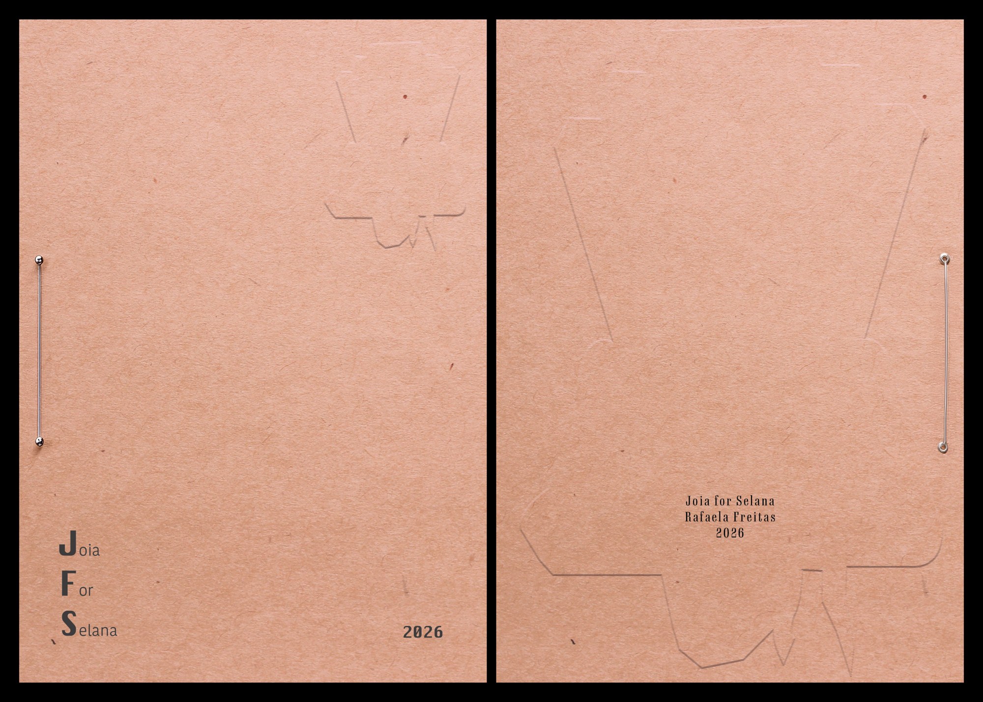
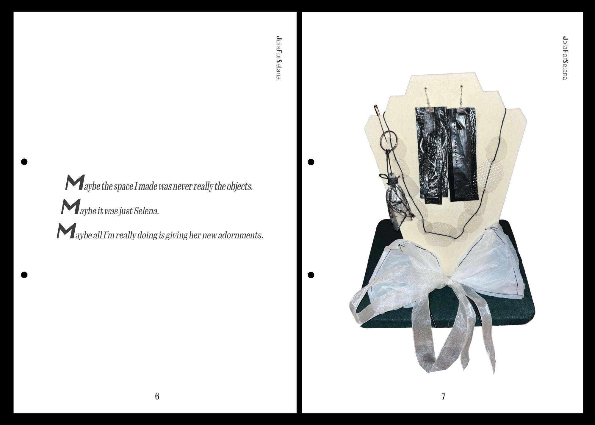
A5 — 148 × 210 mm (5.8 × 8.3 in)
Joia for Selana — Booklet
Multidisciplinary project
2026
Multidisciplinary project
2026
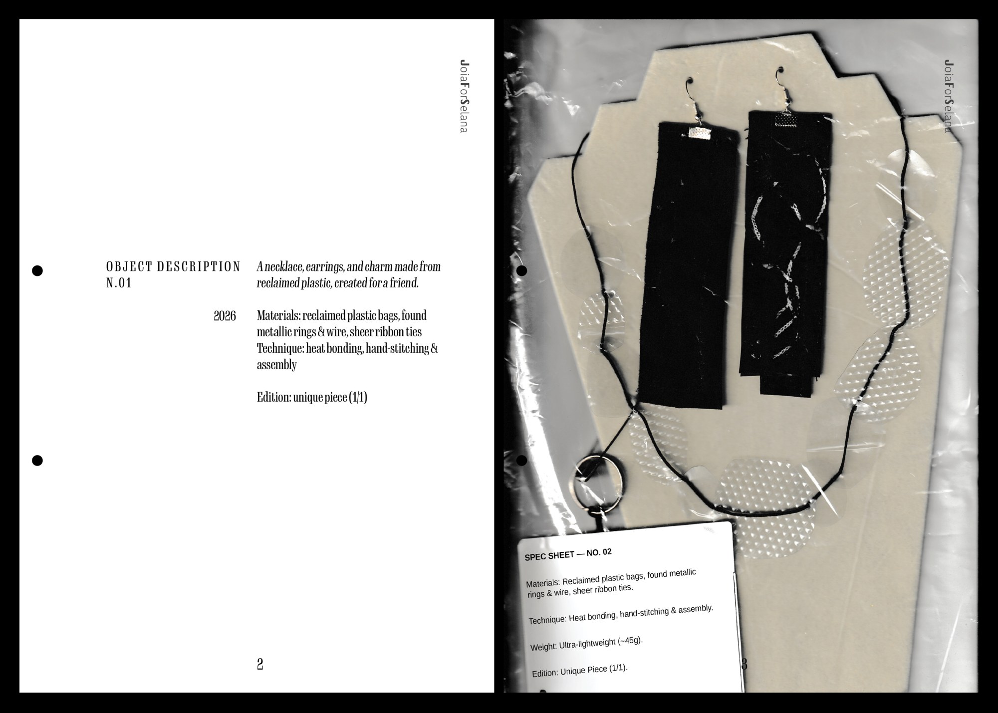
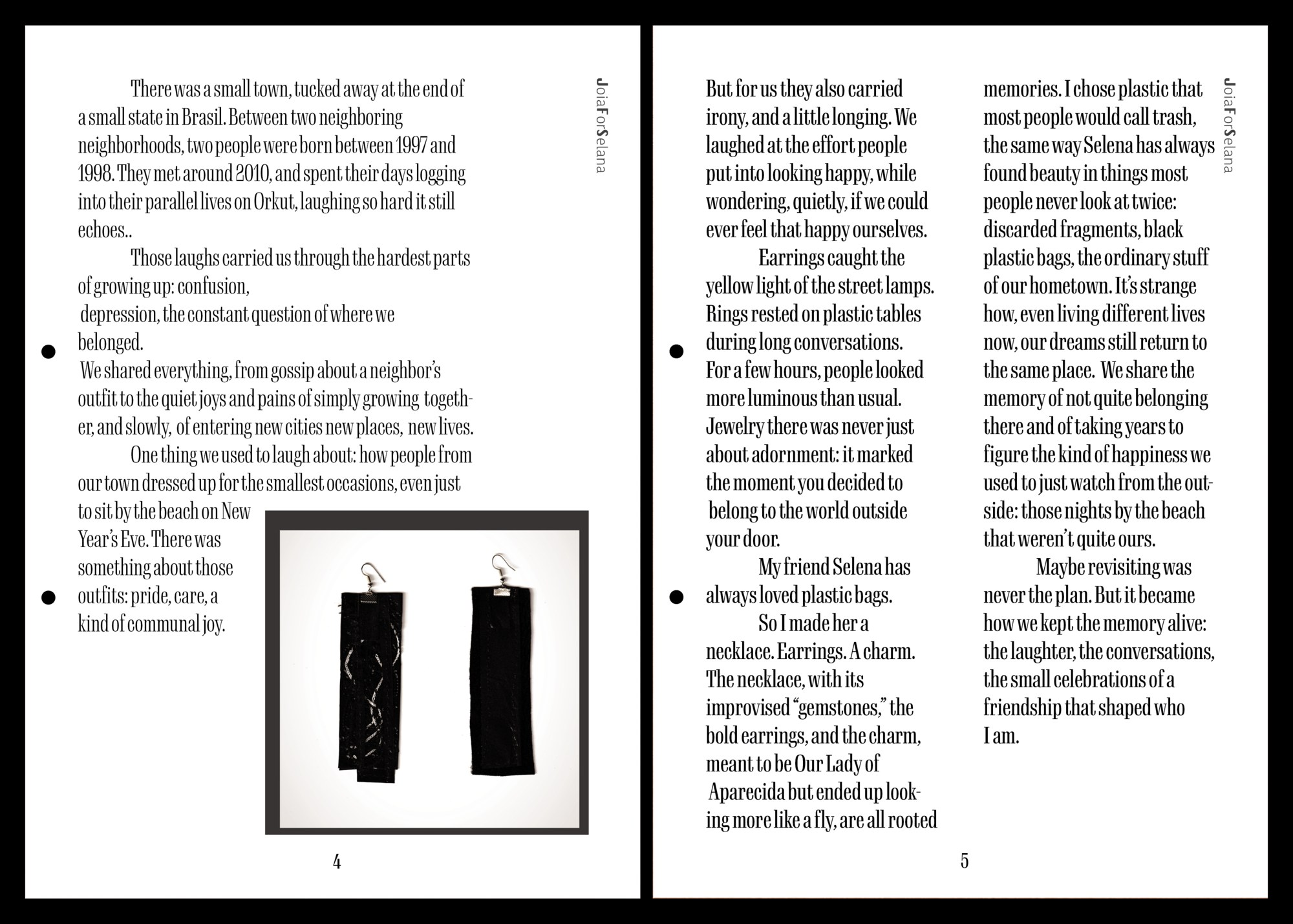
A multidisciplinary project combining creative writing, editorial design, and handmade jewelry. I sewed a necklace, earrings, and charm from reclaimed plastic bags, wrote the story behind them, and compiled both into an Extended Spec Sheet — exploring memory, friendship, and reclaimed materials through the format of a personal archive.
This object was made for a fiber arts class, for an assignment to create something about happiness using an unconventional material. After thinking about it for a while, I thought of my friend Selana and her favorite medium: trash bags. I kept thinking about making something for her, so I did.
While making it, I kept thinking about our story and how it connects to our hometown — that's why I landed on earrings. It made sense, since people from our hometown are always trying to find places to wear cool clothes and jewelry, even though there's not much to actually go to. So I wrote a memory text around that.
Then I kept pushing the idea further, thinking about how ironic it was to display the piece like something fancy when it's actually made of plastic. That's why I made the spec sheet — to dig deeper into that irony. That's how the project turned into an editorial piece.
Key Project
01
02


8.5 × 11 in — 21.6 × 27.9 cm
03


approx. 20 in — 51 cm
Key Project — Ceramic Tile
Colored clay, clear glaze
2024–2026
Colored clay, clear glaze
2024–2026
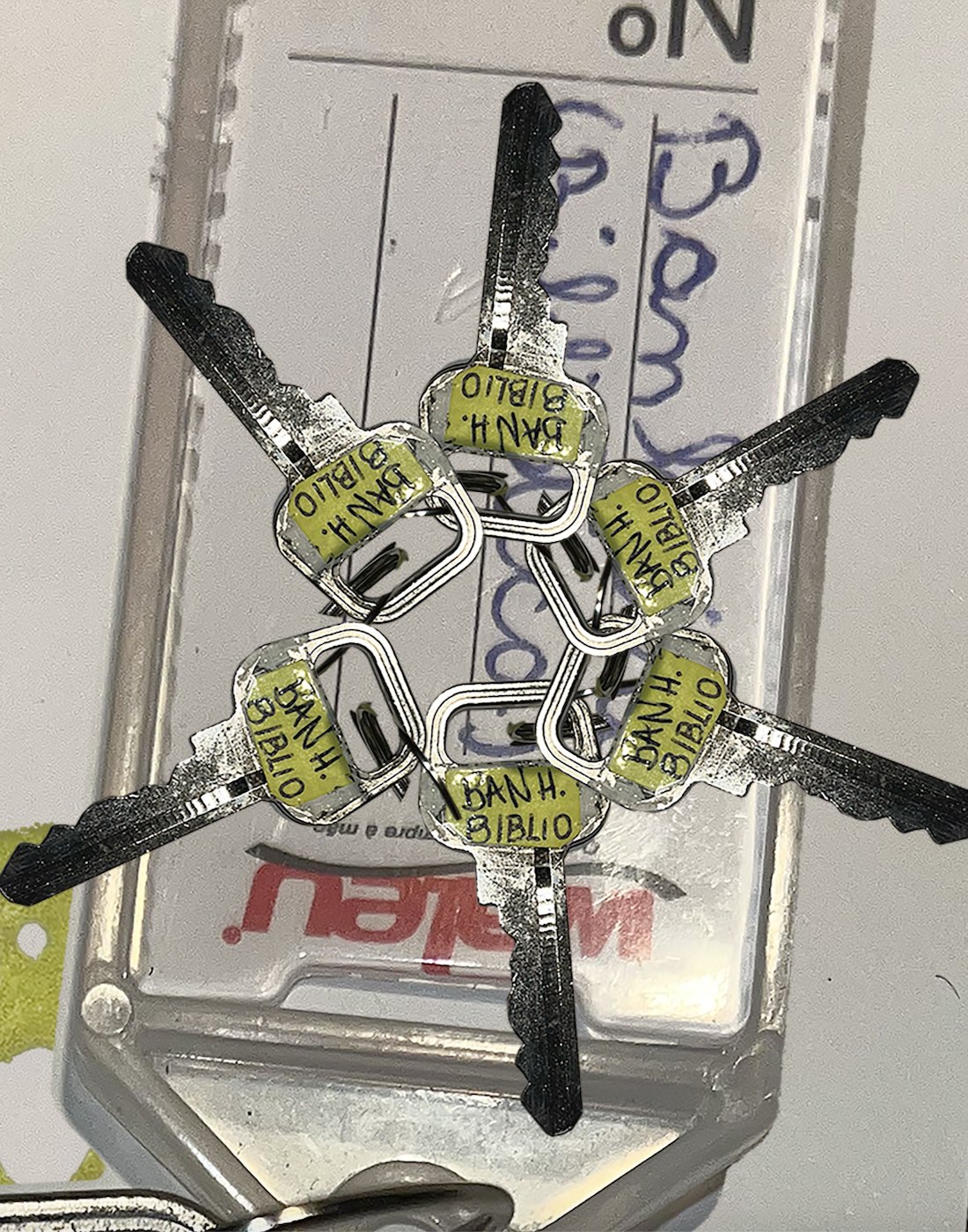
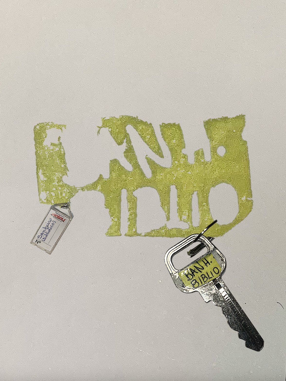
Key Project began with an object I never meant to keep.
It's the key to a bathroom, specifically the library bathroom, at the school where I used to work in Brazil. I don't remember taking it. I don't remember packing it. A year later, already living in Los Angeles, I found it sitting quietly in the pocket of an old jacket, as if it had followed me the whole way without asking.
01. In 2024, an assignment asked me to build a stop motion piece in Photoshop. I chose the key as my subject, framing it, breaking it apart into collages, layering it across time. It felt like the only honest choice. The key had already done to me exactly what I was trying to represent: it had traveled through time on its own, uninvited, and arrived somewhere I never planned for it to be.
02. The following semester, a new assignment asked for three magazine covers. I used the same key again, this time in Photoshop and Illustrator, to build Overtone, a fictional art and culture magazine. The issue I designed centers on shared spaces and private stories, thinking specifically about that school bathroom. It's a place most people walk past without a second thought, but one that quietly absorbs years of conversations, silences, small rebellions, and the kind of memory that only accumulates when no one's watching. A bathroom, like a key, is rarely just functional. It's territory, shaped less by its use than by what happened inside it.
03. Over a year later, I returned to the key a third time, now in ceramic. I built it using colored clay and a clear glaze, deliberately broken and reassembled like a puzzle, aged to look like far more time had passed than it actually had. That distortion isn't a mistake. It's the most accurate part of the whole project. More time has passed for me, emotionally, than the calendar has any way of proving.
The Short-Lived Fame of Orkut


Short-lived Fame of Orkut
Code pen
Designer: Rafaela Freitas
2026
Code pen
Designer: Rafaela Freitas
2026
I got curious one day: if I searched for Orkut on Google Scholar, outside of Brazil, would anything come up? It turns out there isn't much research on it in the Northern Hemisphere. Orkut lived and died as a mostly Brazilian phenomenon, barely documented internationally.
Then I found one piece, published by UCL (University College London), that treated Orkut as a real social testimony rather than a footnote. I used to spend hours on Orkut myself, so reading someone else's academic account of something so personal felt strange in a good way. I decided to build a page around it.
The assignment was for a web design class: build a page with navigational elements guiding the reader through different sections or parts of a text. The theme was open. I chose Orkut on purpose, using the platform's own interface as visual inspiration, but pushing it slightly forward into a 2020s visual, all bold, oversized type for the headlines. It felt right: Orkut belongs to a very specific moment in Brazilian internet history, and I wanted the design to sit right at the edge of that memory, familiar but not exact.
It took about a week to build.
Casa dos Tempos


Rafaela Freitas
2025
2025
Casa dos Tempos: Brand Identity & Social Media. Developed logo alternatives and refined the original visual identity originally, and designed the complete social media content system, including templates and visual structure for ongoing posts.